Refocusing a Feature
Improving a misused feature
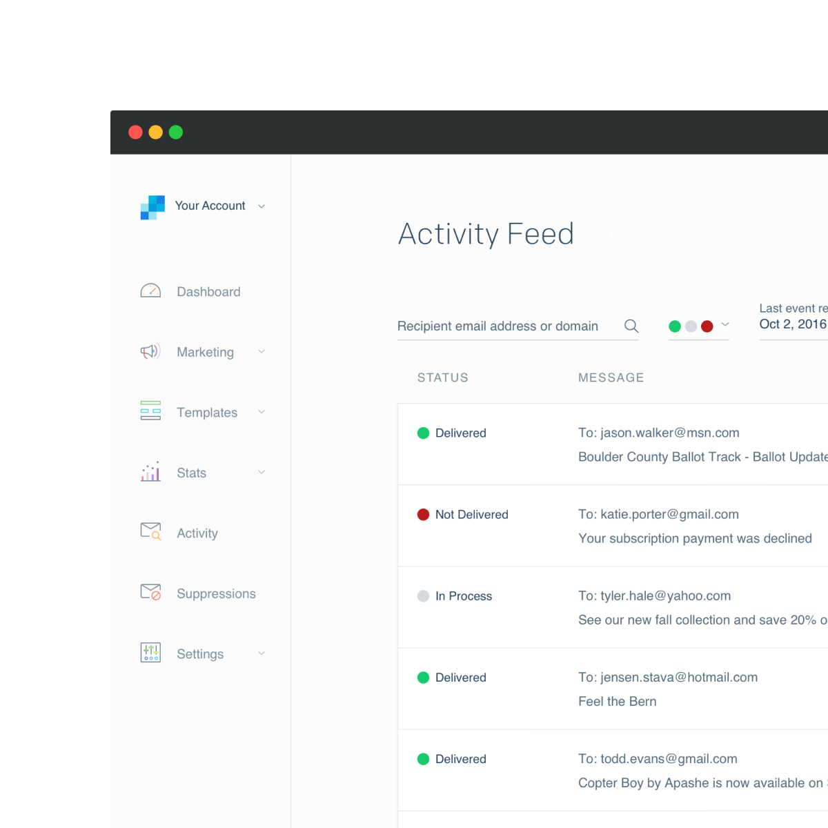
The Email Activity Feed is the most heavily used UI feature in SendGrid. Originally created as a lightweight query interface to our email event stream, it evolved into the primary troubleshooting tool when email wasn't reaching intended recipients.
But popularity has a price. It was used in ways beyond its original intent and was criticized for its limitations. It was clear from onboarding research and other feedback channels that we needed to redesign this from the ground up, focusing on user goals at the forefront.
Identifying the "What?"
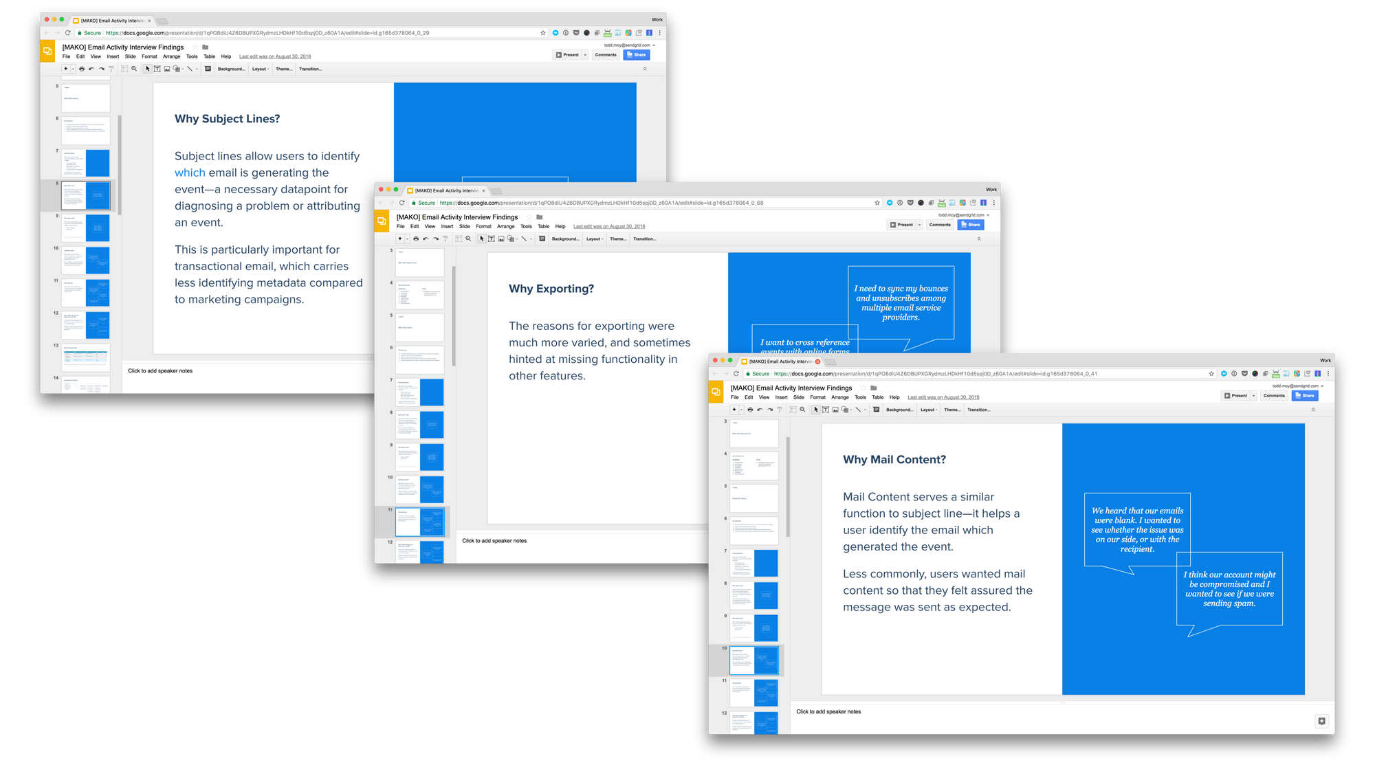
We had no shortage of in-app feedback for the feature. This provided a solid basis to start understanding how people were using the feature.
My first step was to make sense of the disparate things we were hearing. I exported the data and started categorizing it by themes.
Digging into the "Why?"
Armed with clues for the most nagging problems, we conducted 1:1 interviews with users. Here, we sought to understand the contexts they were troubleshooting and what information they needed.
As is often the case, user requests didn't need to be taken at face value. Through laddering we uncovered root causes that helped us articulate the problem while opening the door to a variety of solutions.
I presented these findings to gain buy-in for the project and to help build empathy with users.
Exploring Potentials
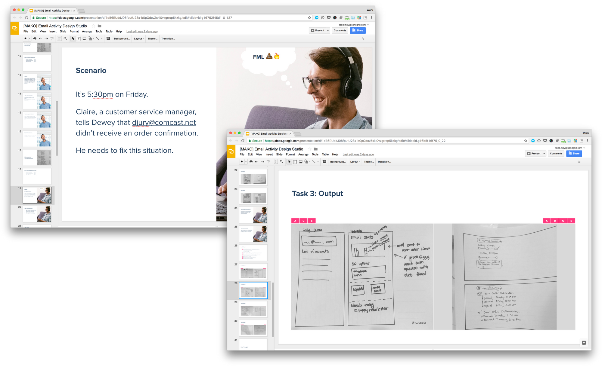
Armed with these insights (and with executive support), we formed an engineering team and kicked off the project. During this, I facilitated a design studio based on the themes identified earlier. After briefing stakeholders on the research, we sketched solutions for a few different scenarios of use.
We discussed the designs and riffed on each others ideas, eventually winnowing down to a few strong concepts. Because the team was involved in the design phase, they understood the value and were invested in the solution.
Moving to low-fidelity
Building off of the ideas generated in the studio, I started wireframing alongside engineers and product managers. These initial iterations were quite crude, often just chunks of UI laid out on a page. But they were concrete enough to convey ideas, have meaningful discussion, and build shared understanding.
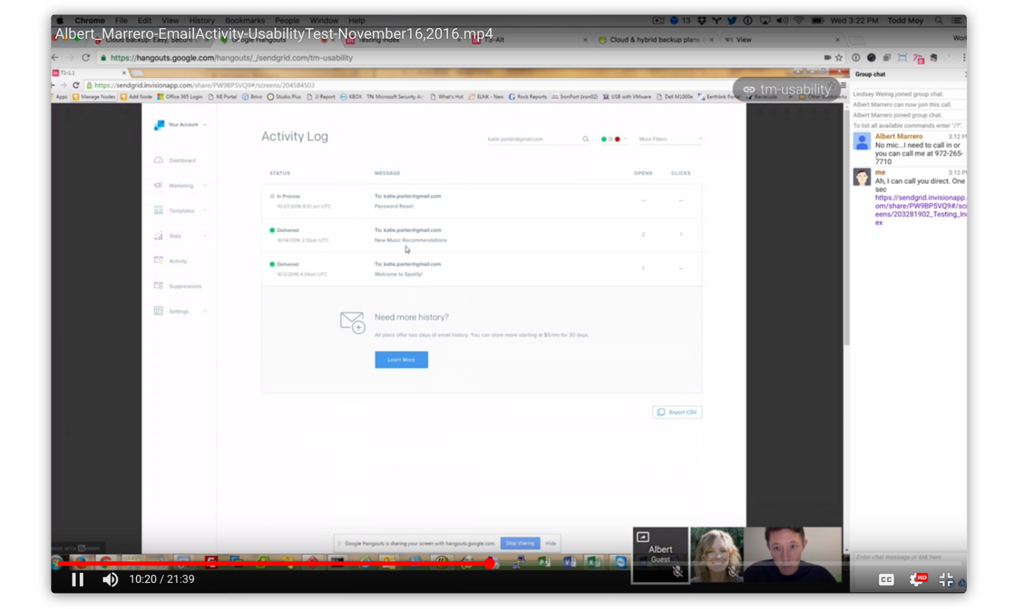
Testing with users
As our confidence in the solution increased, so did the fidelity of the designs. Throughout this period, we continued to usability test and iterate.
Progressively releasing
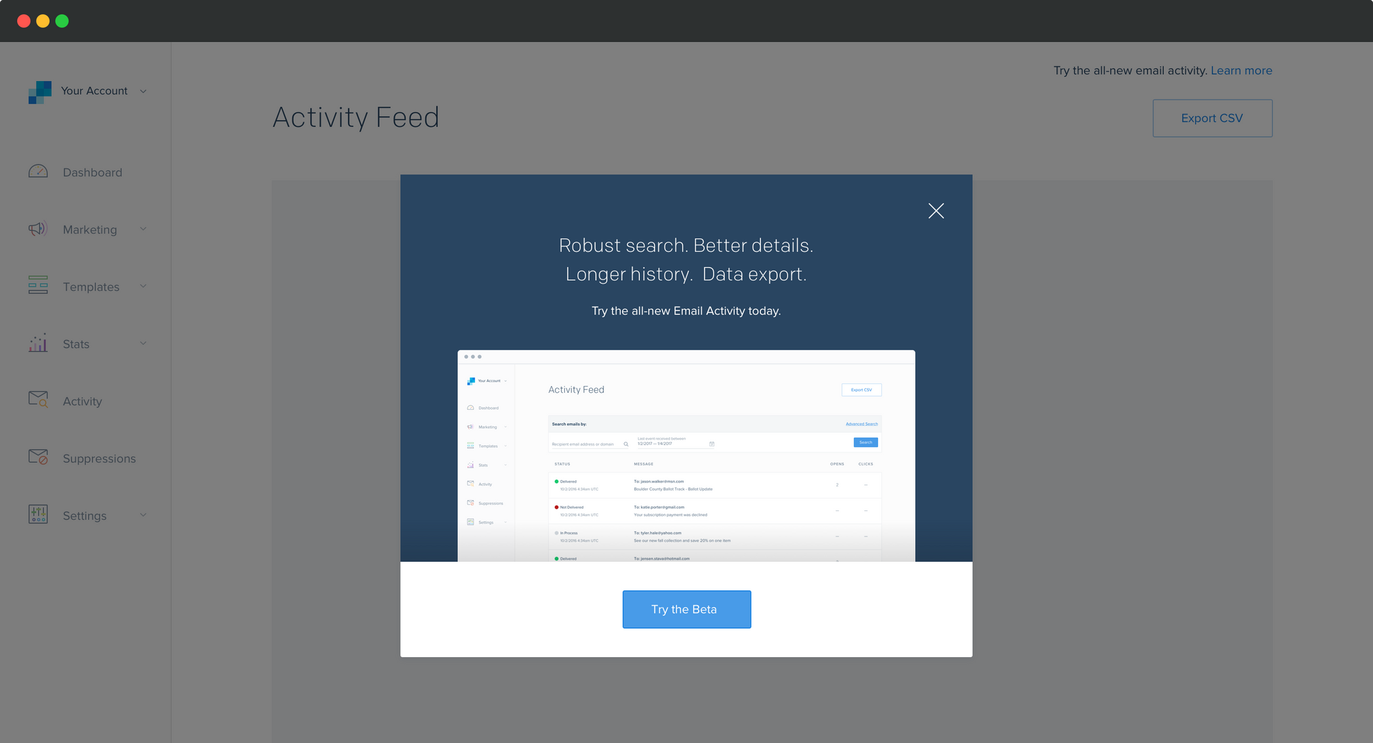
We then moved into a build that customers could use. Early into the process we started inviting users—first through a feature-flagged closed beta and later an opt-in open beta. For a few weeks, we ran both experiences in parallel. This let us understand how users reacted to the new design, while not forcing them to cut over immediately. It also gave our engineers time to tune the performance.
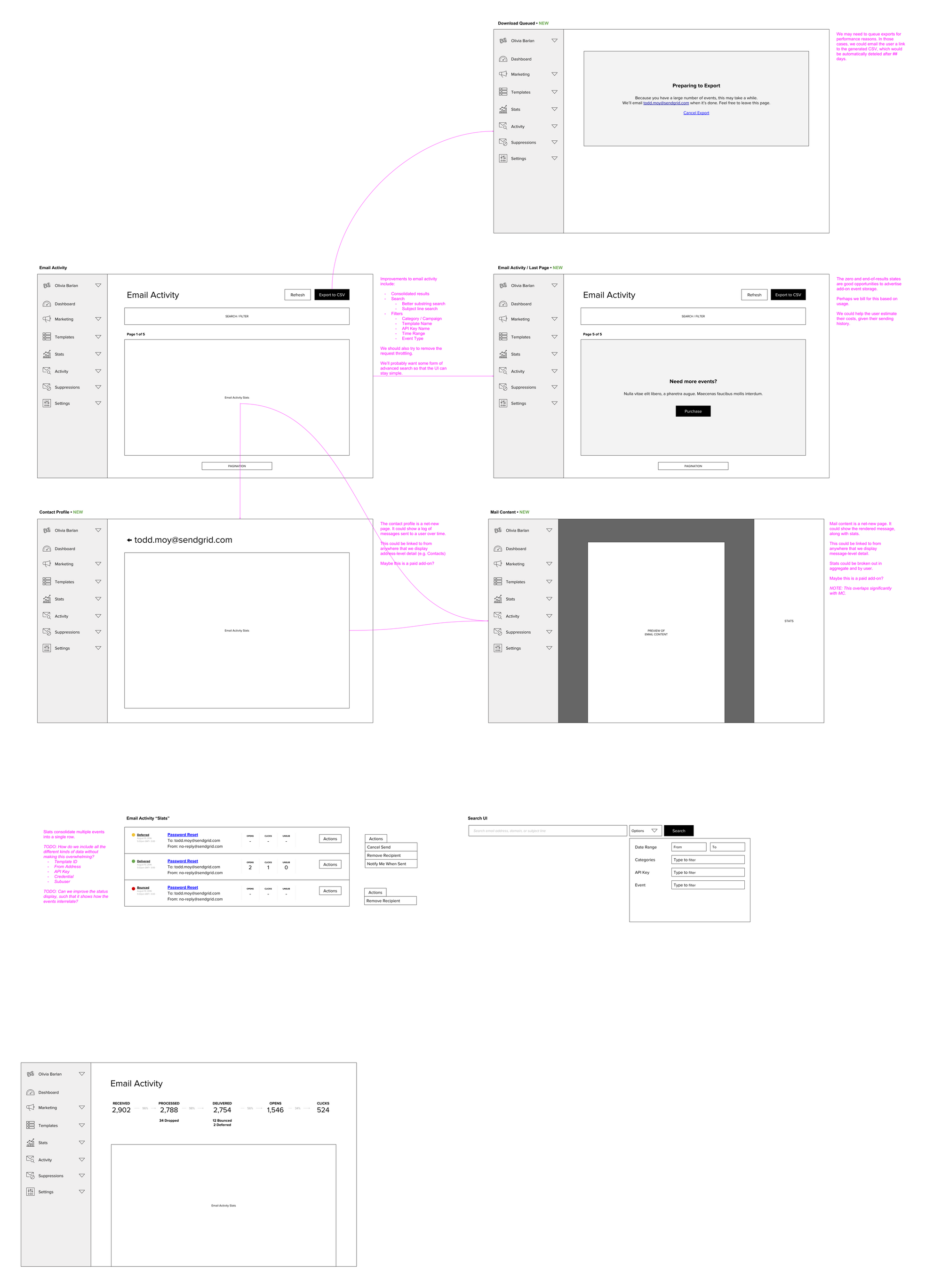
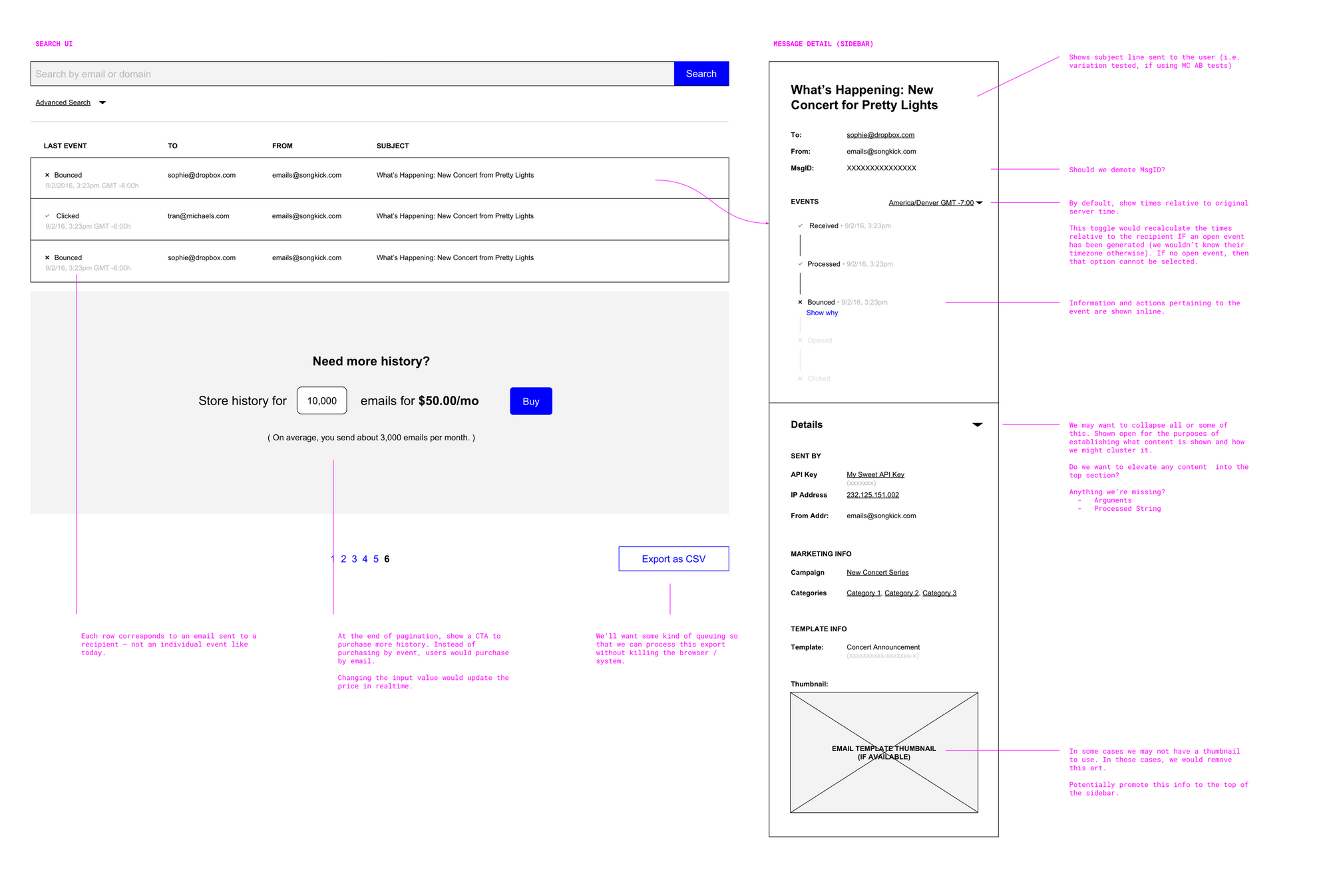
Final Design — Search
The main entrypoint remains the search page. From here, users can execute simple, common queries or conduct ad-hoc searches based on more esoteric metadata.
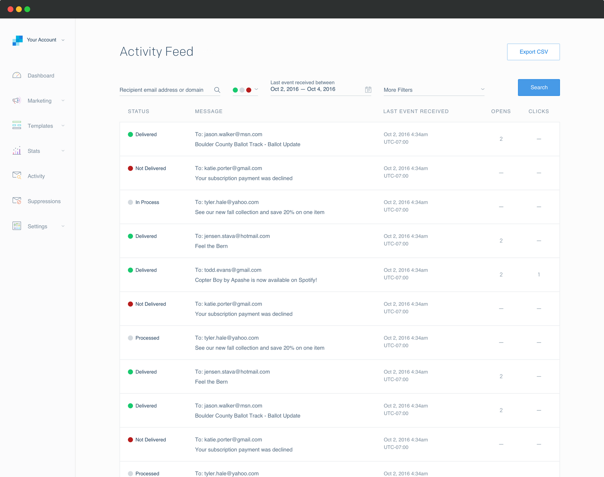
Critically, the results are grouped by email. Previously, events were returned chronologically, which made it hard to piece together what happened to a single email.
Grouping results by email while allowing ad hoc searching, at scale, is a computationally (and financially!) expensive query. But clear user feedback early on backed up this design decision.
Final Design — Email Detail
On the detail page, users could view detailed information about each email. An important UI feature is the "timeline." In early research, we found that users didn't have a strong mental model about when or where events occur during the lifetime of an email. This pattern helps them pinpoint where problems (if any) are occurring.
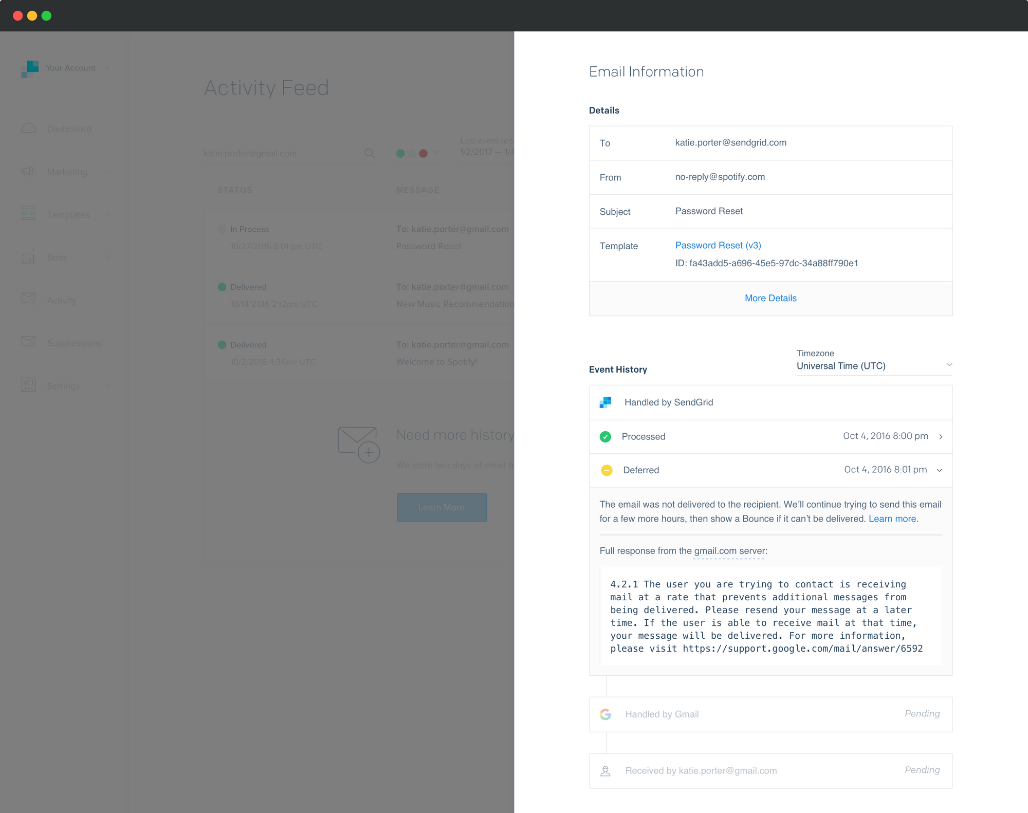
The Event History timeline helps users isolate exactly where issues occur.
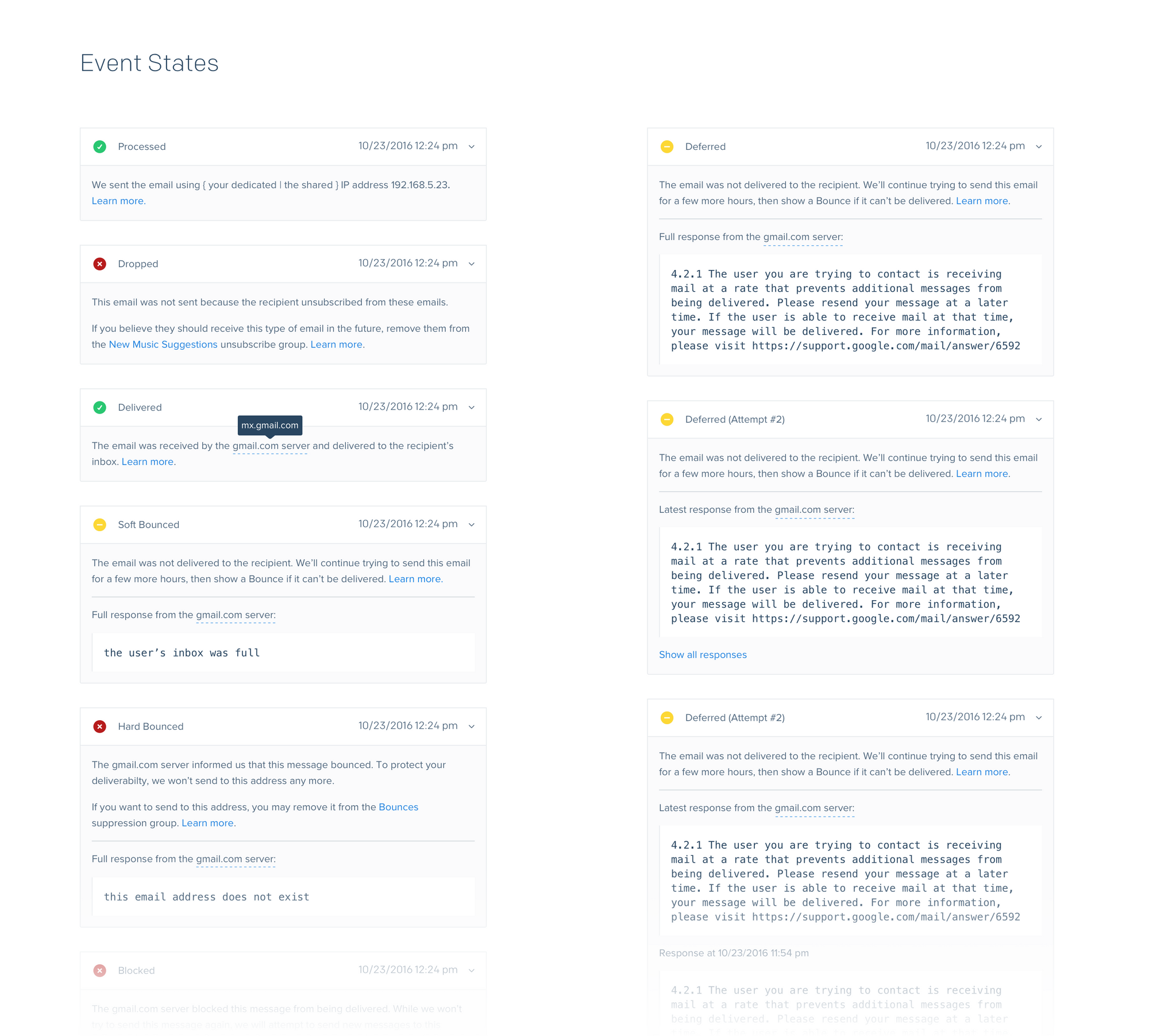
To help demystify events, I wrote clear, action-oriented interpretations to the server responses.

A card-based architecture accommodates dozens of event types, each with varying details.
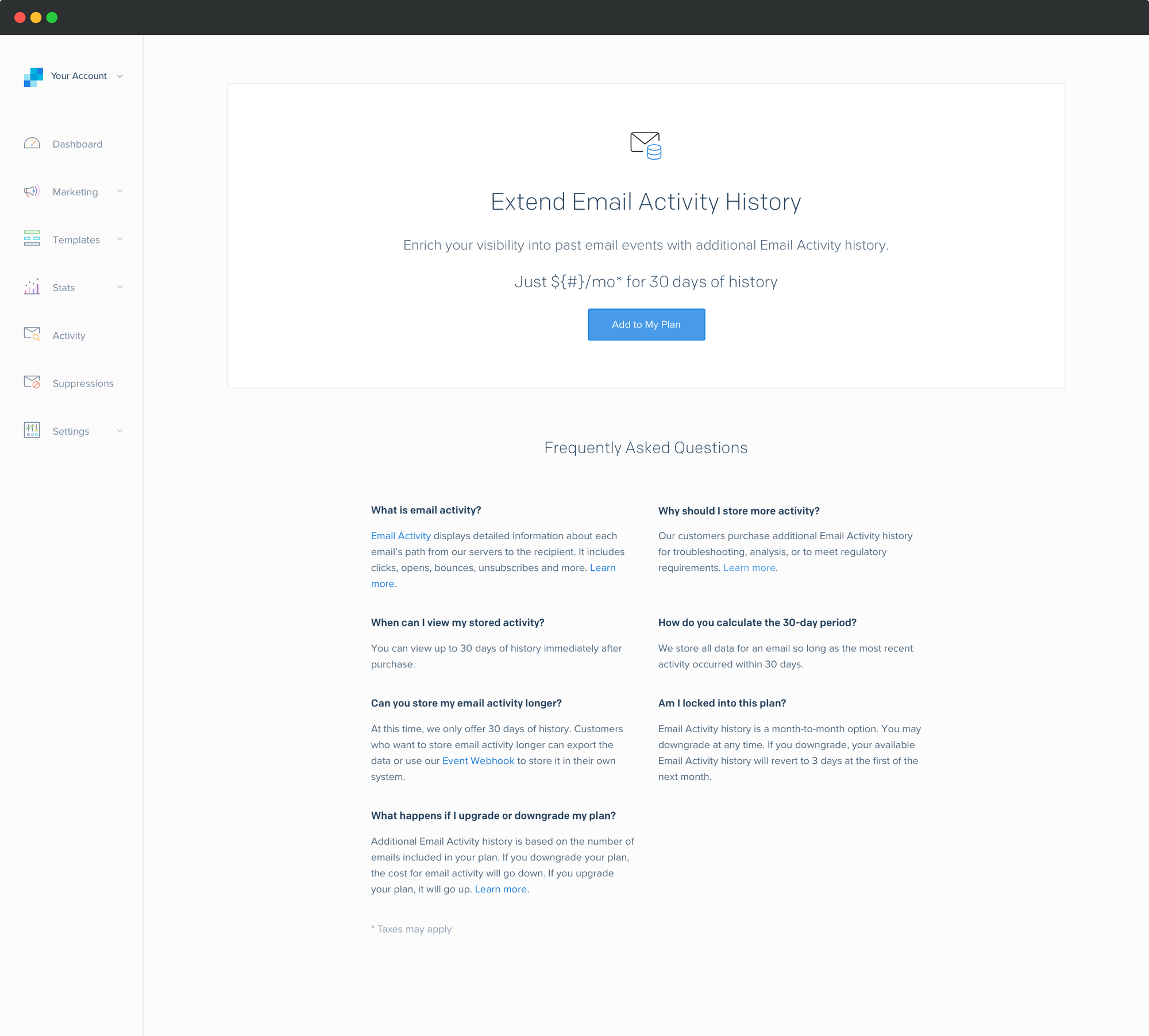
Final Design — Upgrade
Users could upgrade to retain longer periods of history. Pricing was calculated based on the user's current plan.
Results
The improvements have been widely acclaimed—a testament to our crisp understanding of user needs.
@sendgrid oh my goodness the new activity panel 😍
This update is freaking awesome. Thank you!
The new activity feed is your best update so far!
I just want to say... it's about darn time and thank you, thank you, thank you. You just made my life a whole lot easier.
Activity Feed beta is amazing! Thank you so much for implementing ... this makes it absolutely perfect.
I like the visual changes as well and it helps us track down delivery issues vs. the previous interface. Please tell the team a big thank you!