Increasing Findability
Making it easier to locate the help you need
As SendGrid matured from a startup, its documentation site began to fold under the volume of content and different types of users.
A new welcome mat
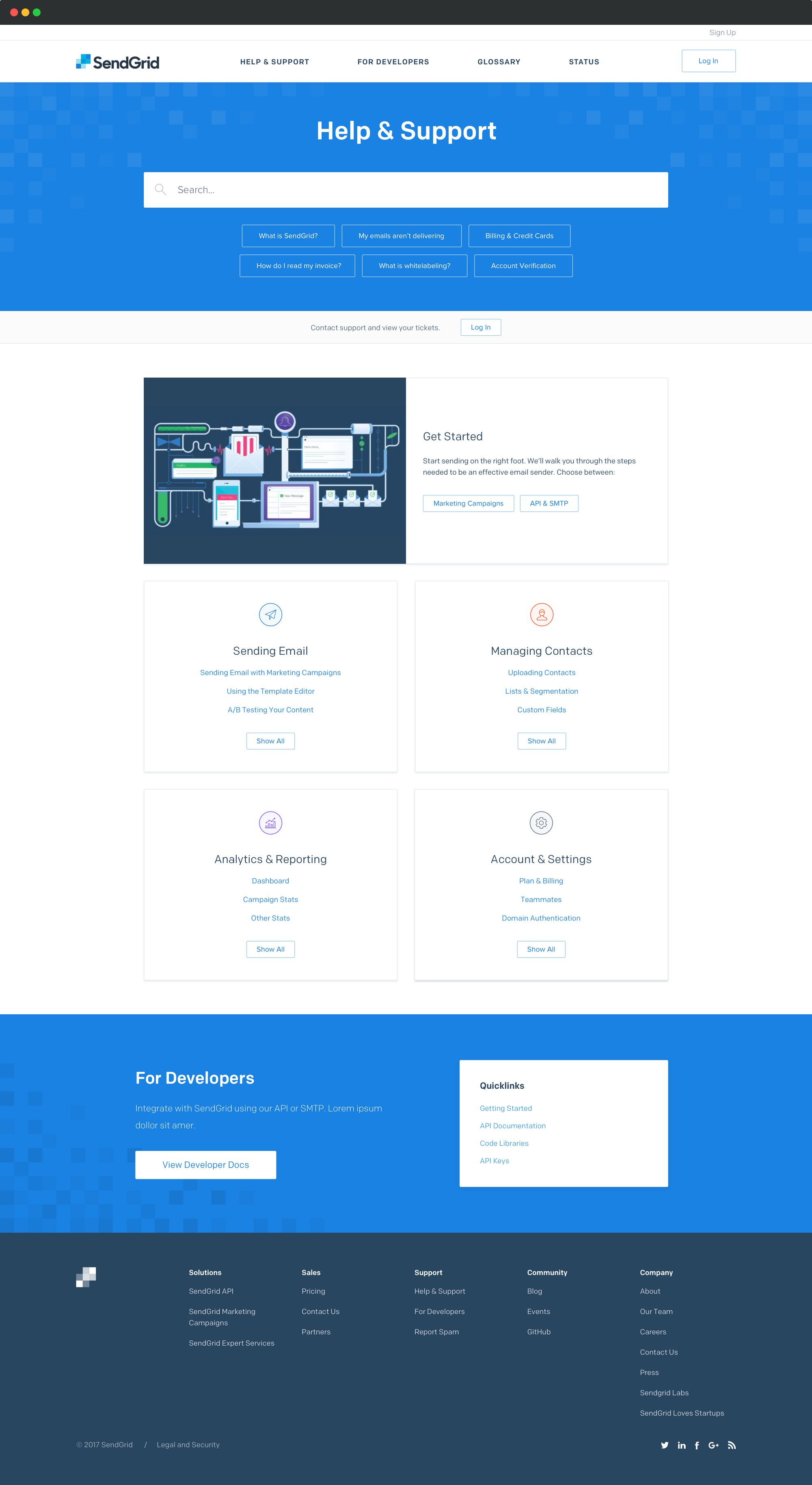
The main docs site curates links to the most commonly requested content. The categories and subcategories were validated through tree testing. Different from the old site, articles could live in multiple locations.
We also placed a conspicuous link to support for users that couldn't find what they needed in Docs.
A space for developers
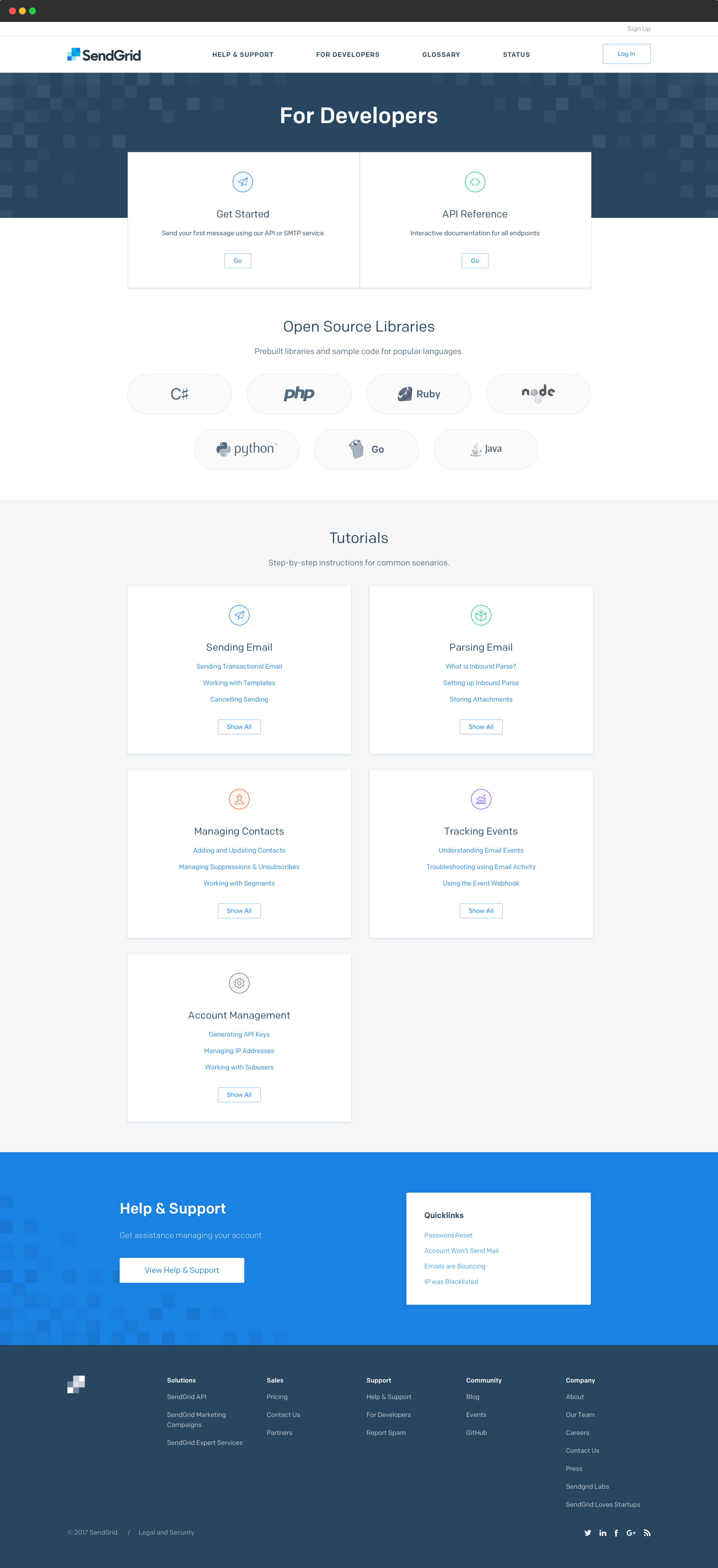
The biggest issue we heard in the past was that developers couldn't find integration-oriented documentation. Marketers, on the other hand, found that they encountered this far too often.
We culled off the developer-oriented resources into a distinct site. This made it easy to find code samples and libraries.
Task oriented-navigation
We conducted card sorts to understand how developers thought about the content, and iterated until we found a good solution.
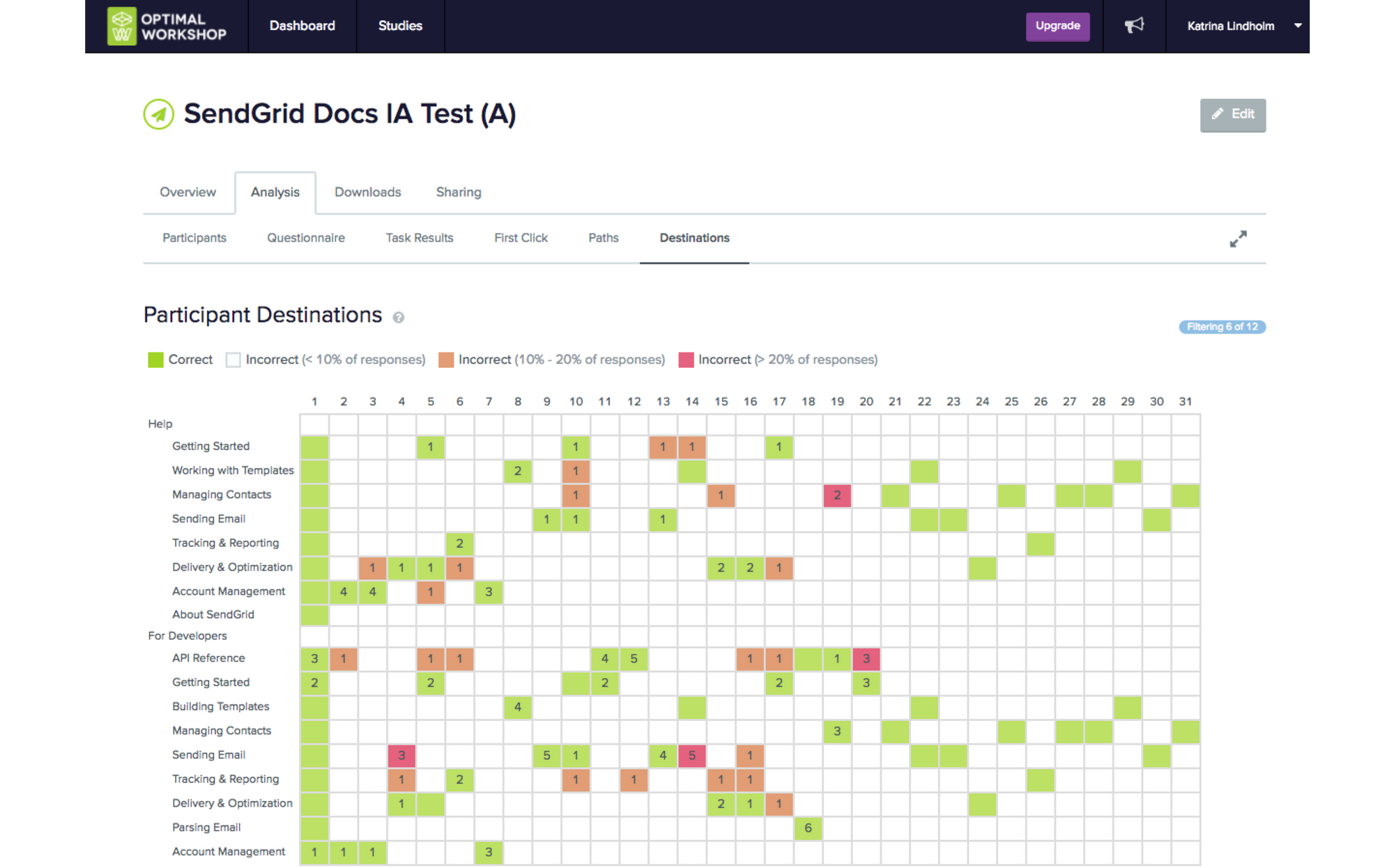
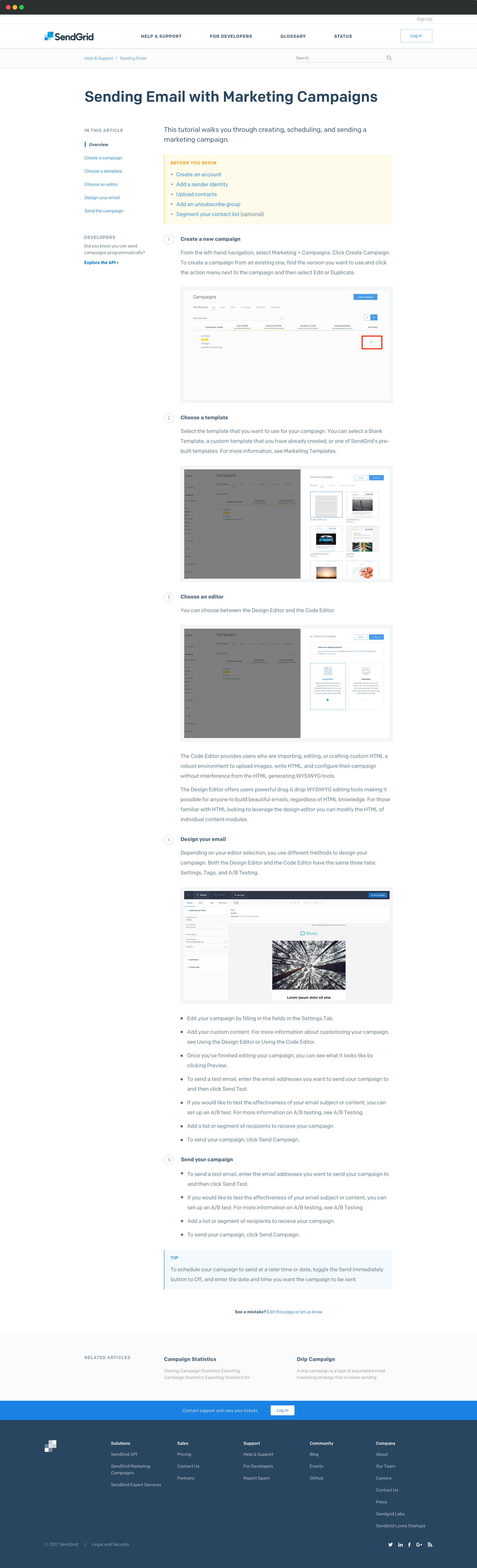
Most of the "how-to" content is organized around key tasks. Formerly, it was organized like the app's navigation.
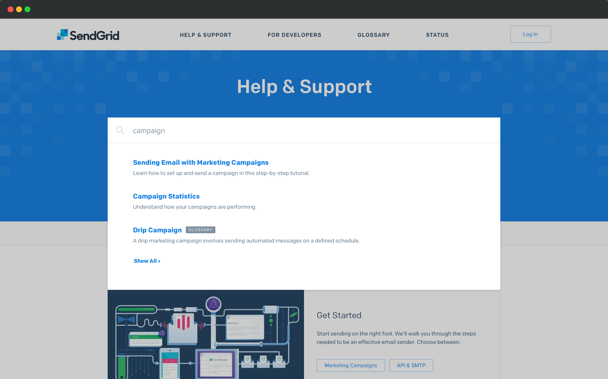
Tuned-up Search
Because our users are search-dominant, we optimized site search using custom ordering, faceting, labeling, and synonym rings.
Improved article pages
In our audit, we found many different pages with similar content. Often this went out of date. As part of the redesign, we consolidated content—eventually reducing the URL count by over 40%.
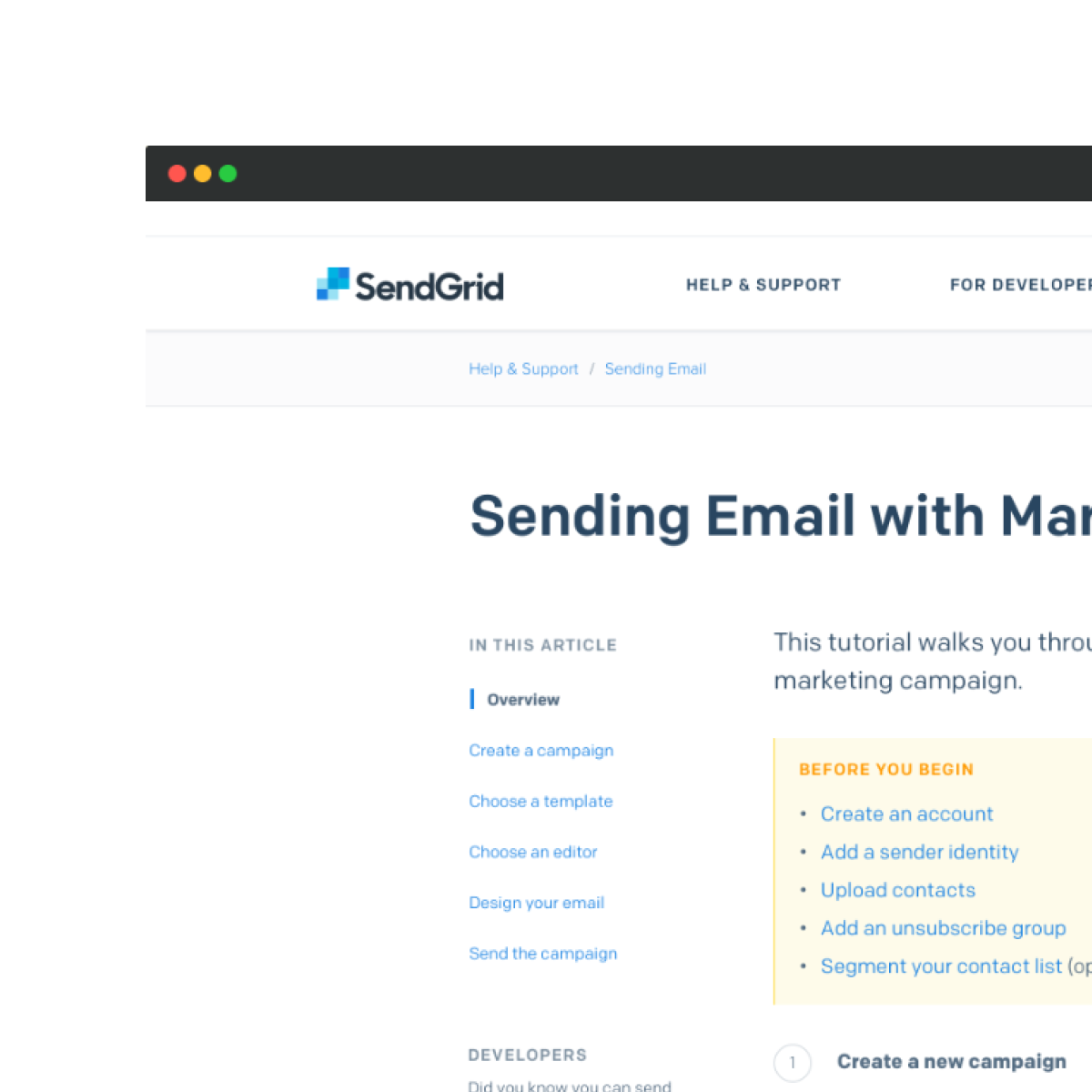
The tech team rewrote docs to be more instructional. Sticky in-page navigation made the longer pages easy to navigate. Prerequisites, when relevant, are called out before the user invests time. Related content is presented at the bottom, providing a helpful suggestion if the user finds the page didn't quite solve her question.