Core Editor
Iteratively improving the Zap editor.
I joined Zapier as Product Design Lead on the Core Editor team, which is responsible for the main interface that users utilize to construct their Zaps. During my tenure, I designed various improvements to enhance our users' ability to build Zaps.
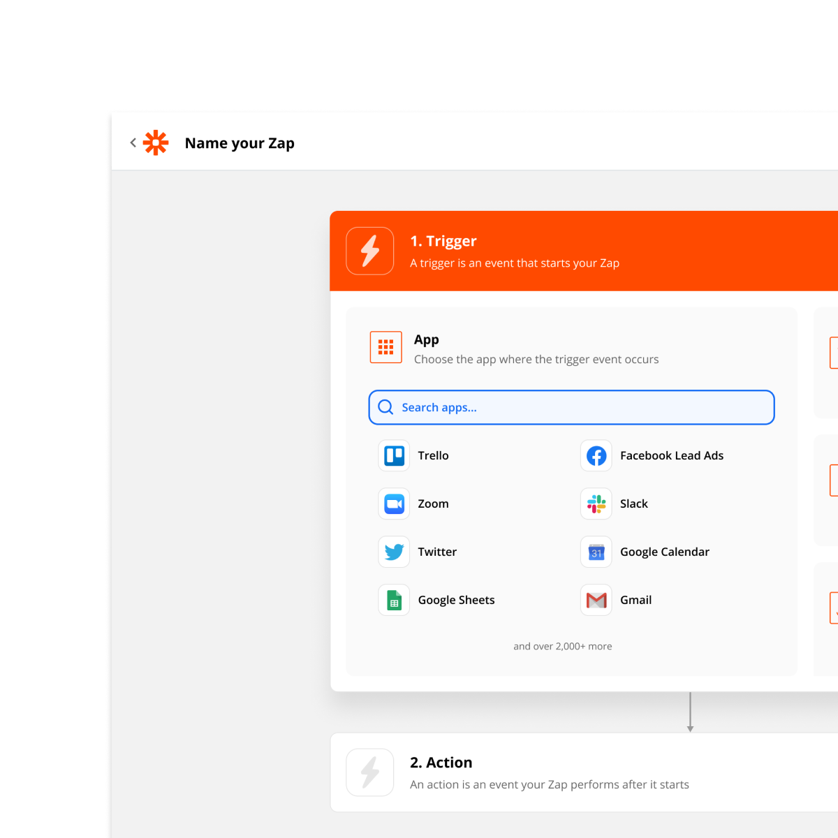
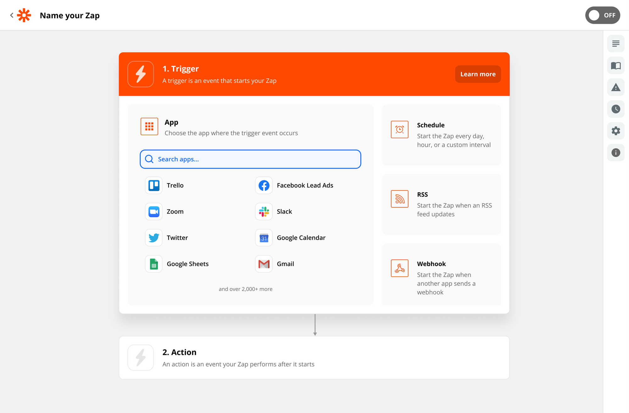
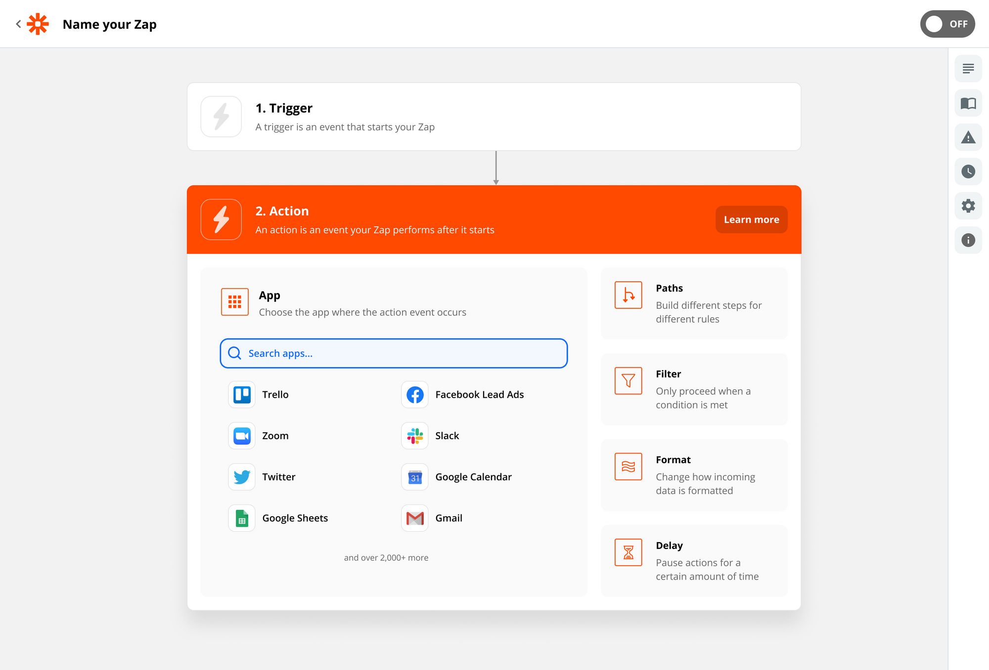
Redesigned step picker
Zapier offers numerous native apps for triggering Zaps and processing data. These utilities are crucial to solving certain automation needs. However, these apps were not easily discoverable; users needed to know of their existence to utilize them.
I redesigned the step picker to highlight native apps like Schedule, Webhook, Filter, Path, and Format. This helped surface functionality critical to constructing many Zaps.
Additionally, I used this opportunity to refine the experience with external apps. The new design first showcases broadly popular apps. Over time, it adapts to display the apps most frequently used by the user or their team.
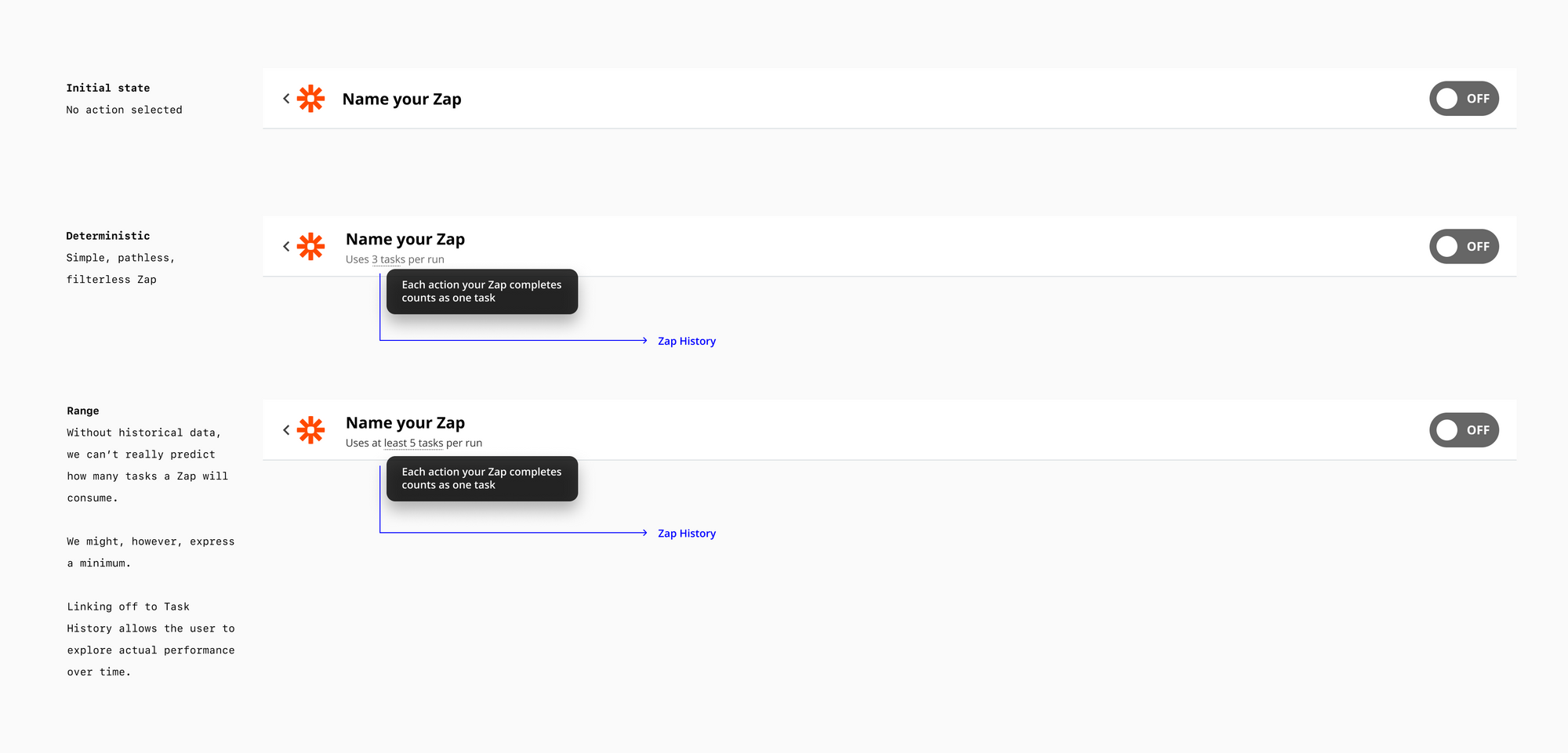
Task estimate
Zapier's billing model is based on tasks executed. When opening a Zap, however, it's not obvious how many tasks will be used. A small intervention in the header helps clarify this.
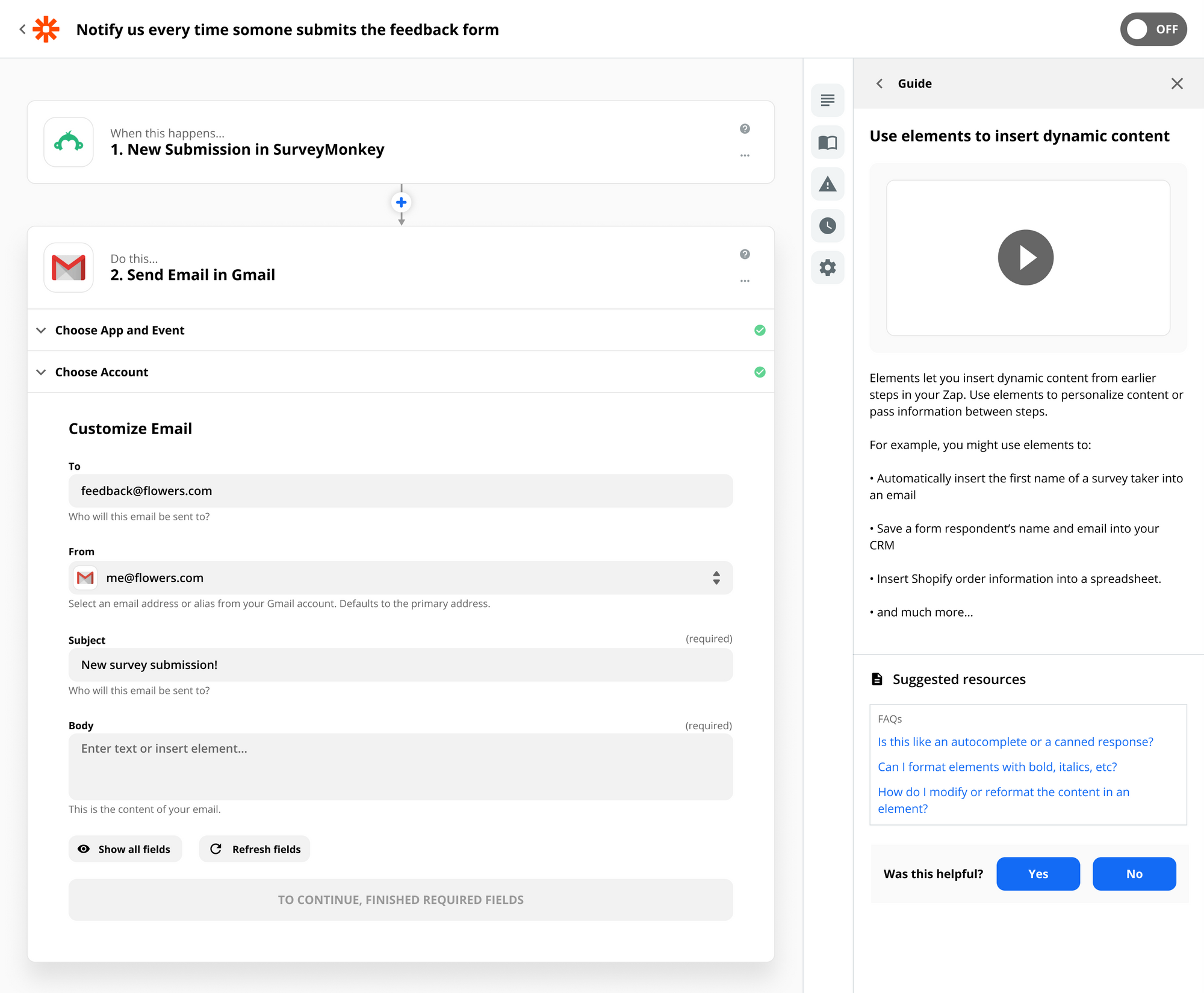
Explaining mapping
Many of Zapier's users lack a programming background, making the concept of using variables to pass information somewhat unfamiliar, yet it is crucial for utilizing the tool effectively. I implemented in-the-moment educational interventions to introduce this concept.
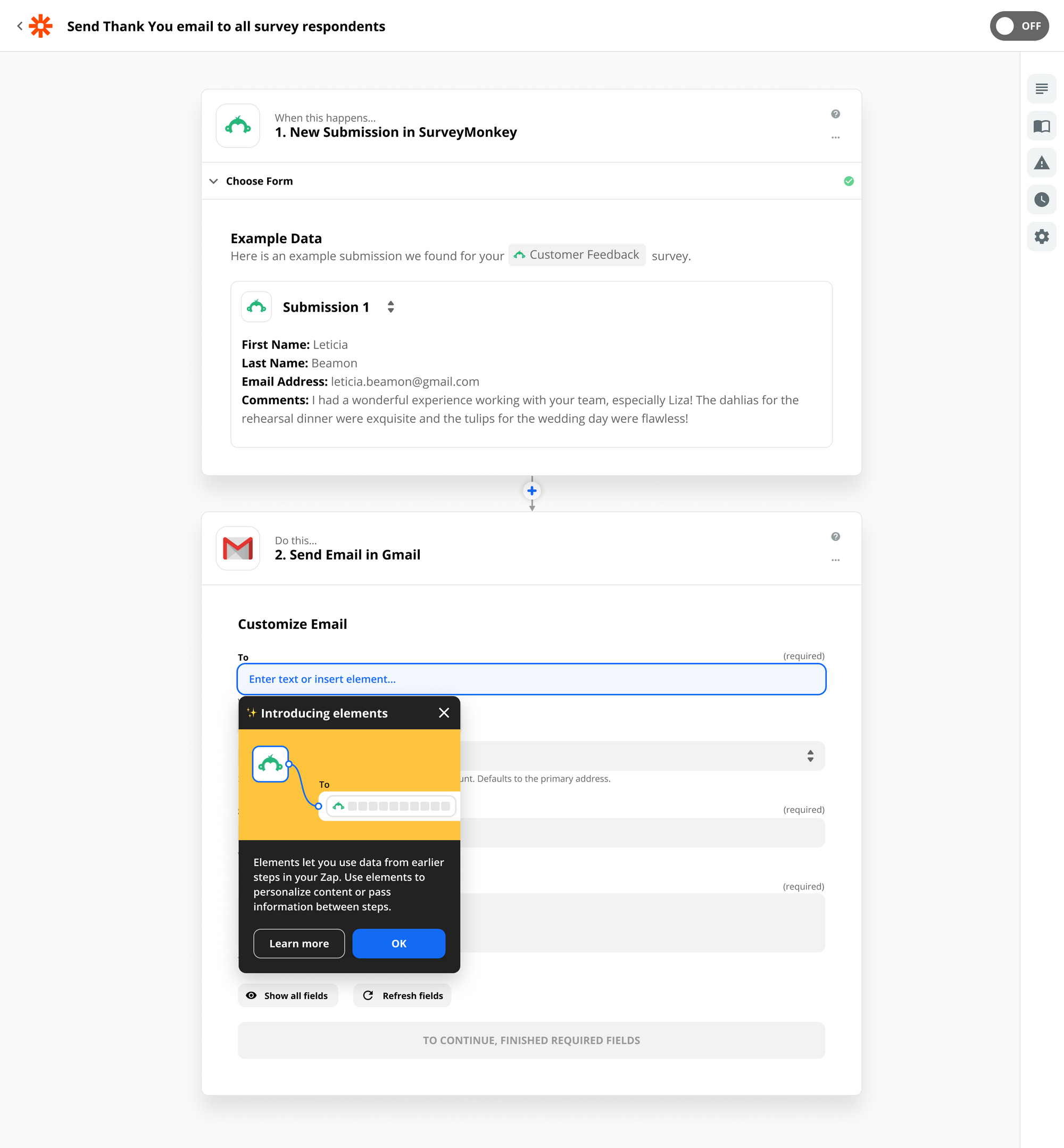
Users seeking further information could access our Guide in the side panel, where they could learn more and watch tutorials without leaving their workflow.
Relevant fields
APIs often include numerous fields that are seldom used, which can frustrate users who typically seek only the essentials. Since we do not control the APIs, altering or reordering these fields was not feasible.
However, by analyzing usage data, we managed to identify and conceal fields that are rarely used. Progressive disclosure allows users to reveal these fields if necessary.
Although this was a simple design change, the effects are significant. In my mind, it underscores the principle that user experience encompasses more than just the user interface.
Impact
With a complex tool like Zapier, there is often no single point of improvement. Talking to users and observing their behavior helped us identify the most significant drop-offs in the funnel. By deploying incremental improvements at friction points, we were able to improve success rates when creating Zaps. It also helps us avoid disrupting users with large changes.
Of course, sometimes more drastic redesigns are warranted. For a glimpse of that, check out my Visual Editor project.