Understanding a Path
Researching and synthesizing the customer journey
Day-to-day, it’s easy to focus narrowly on single feature experiences. This can lead you to miss "the forest for the trees" and not see seams in the overall experience. At SendGrid, we decided to step back and assess the complete multichannel experience for developers.
How we got here
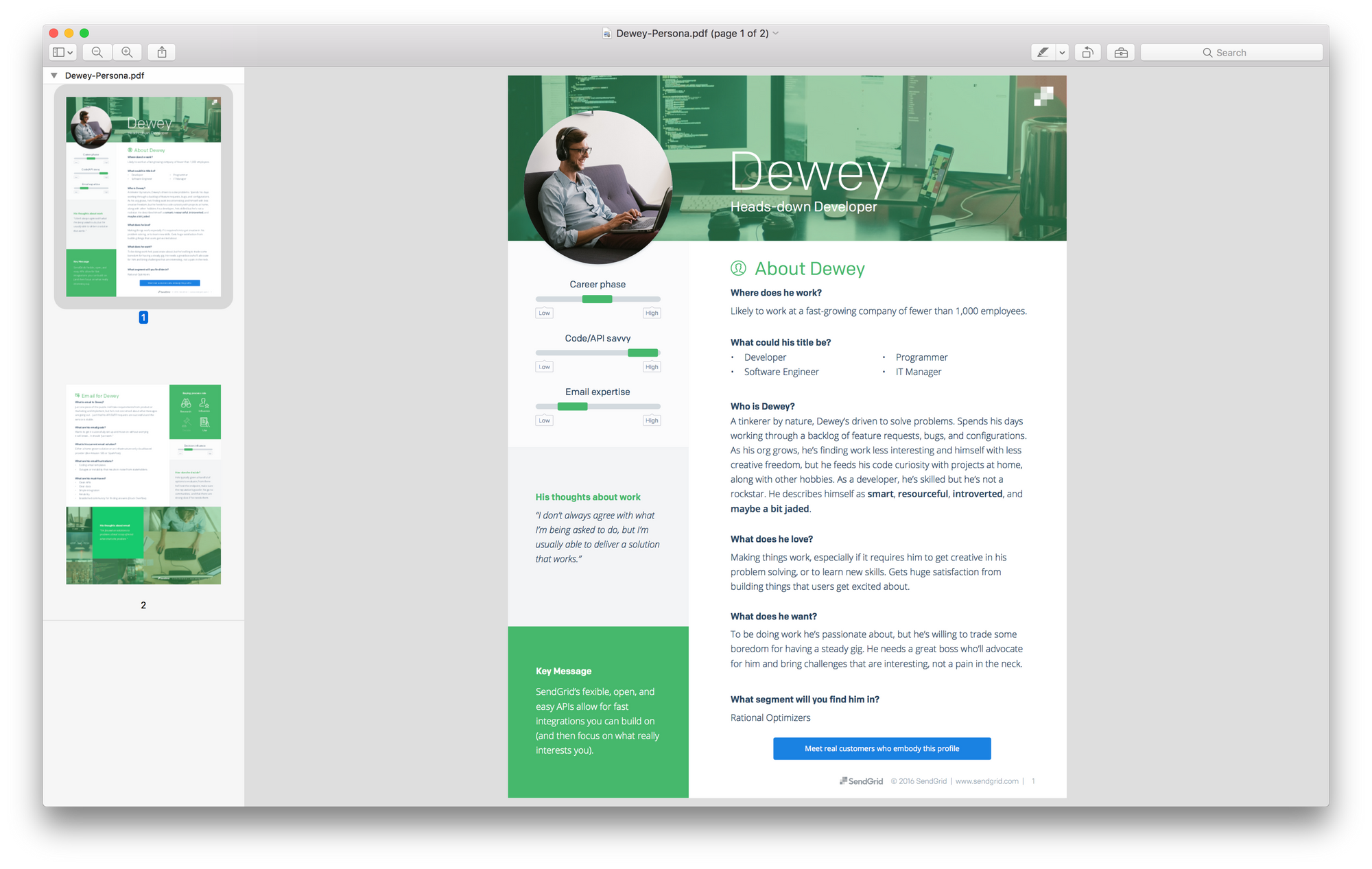
Starting with our core developer persona—affectionately named Dewey—I recruited users using Intercom, Respondent.io, and direct outreach. As with other design projects, we wanted to make sure we focused closely on the users we most cared about.
A multi-faceted research protocol
To elicit insights across the spectrum of the experience, I needed to lean on multiple research methods. These included 1:1 interviews, usability tests, diary studies, and secondary research.
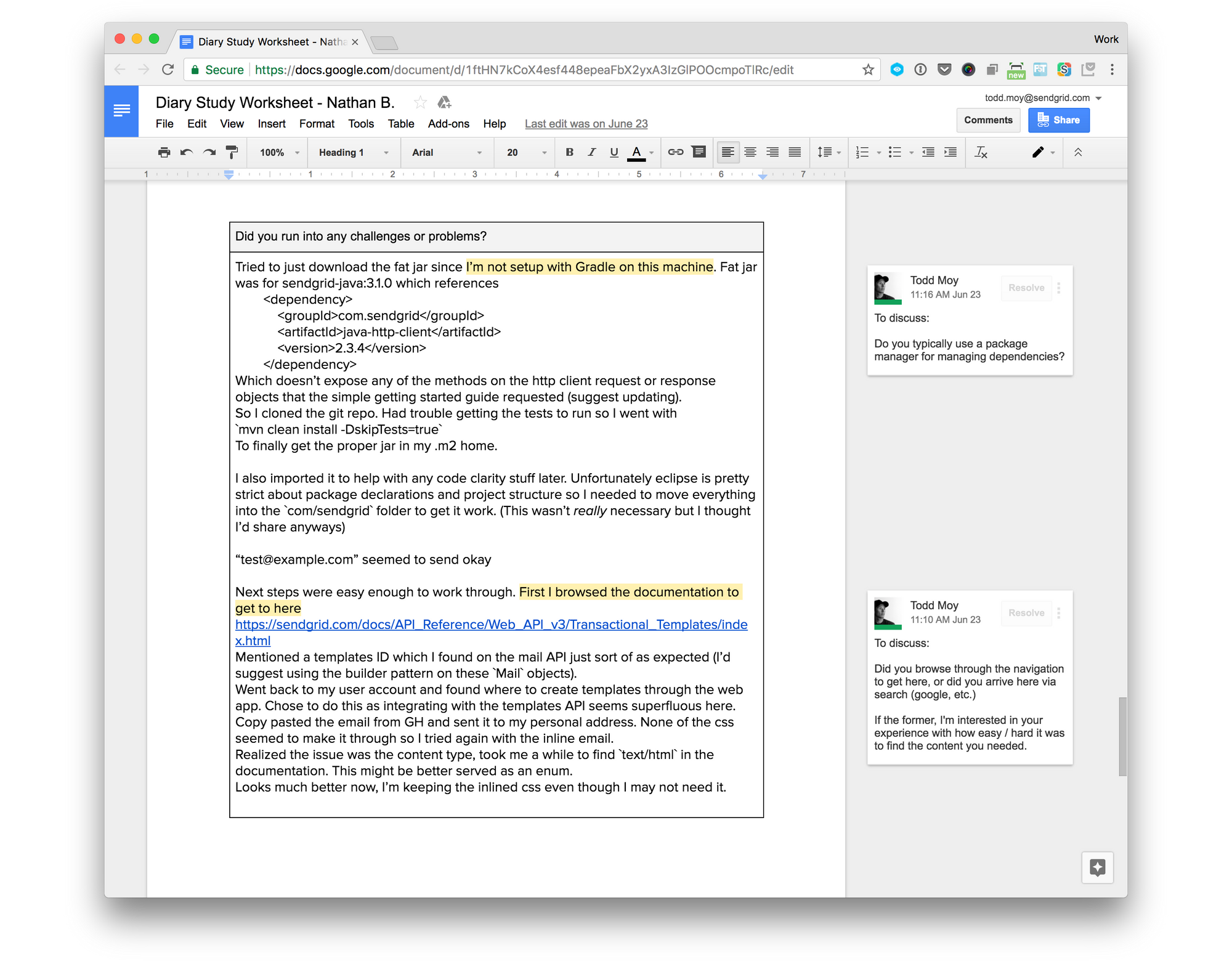
For the diary studies, I wanted to understand the end-to-end experience, which often lasts weeks. To do this, I provided participants a shared document containing instructions and a place to take notes. This allowed me to follow along and ask clarifying questions in the moment.
Consolidating findings
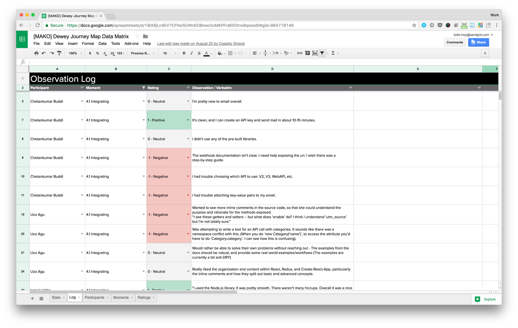
To manage all the feedback coming in, I funneled it all into a single spreadsheet. This let me categorize it by trends, user, moment of experience, and emotional impact.
Incorporating other insights
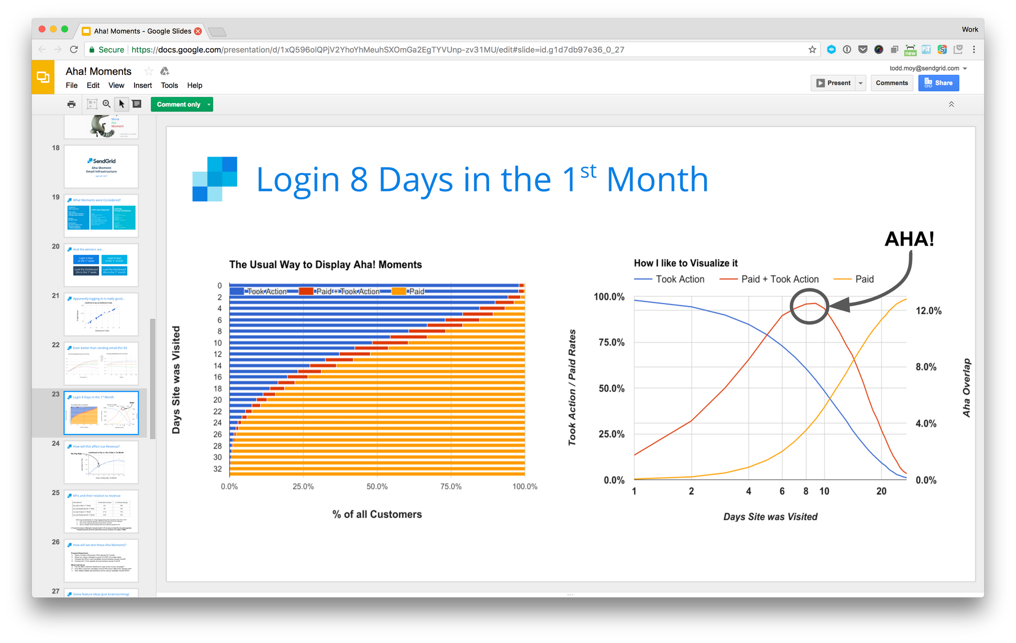
In parallel, Data Science was conducting research into Aha! Moments. I was able to bring their findings into the map, amplifying their effort and providing “the why” to the phenomena they observed.
Final Design
The final design was printed poster-sized and used as a conversation piece for a series of cross-functional design exercises. A tour of the design is shown below.
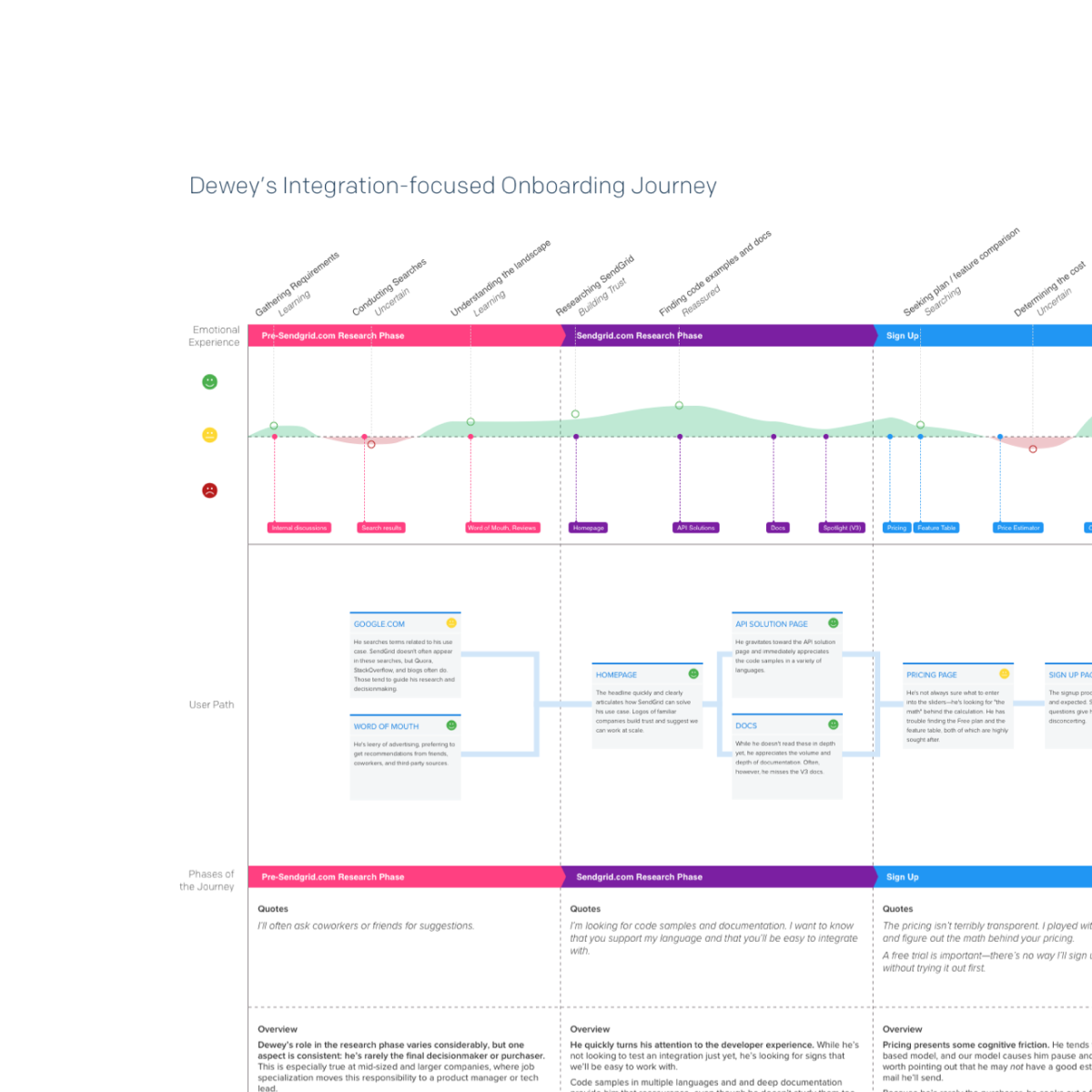
The overall map.
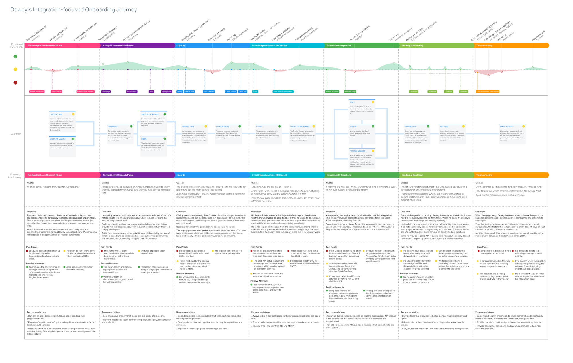
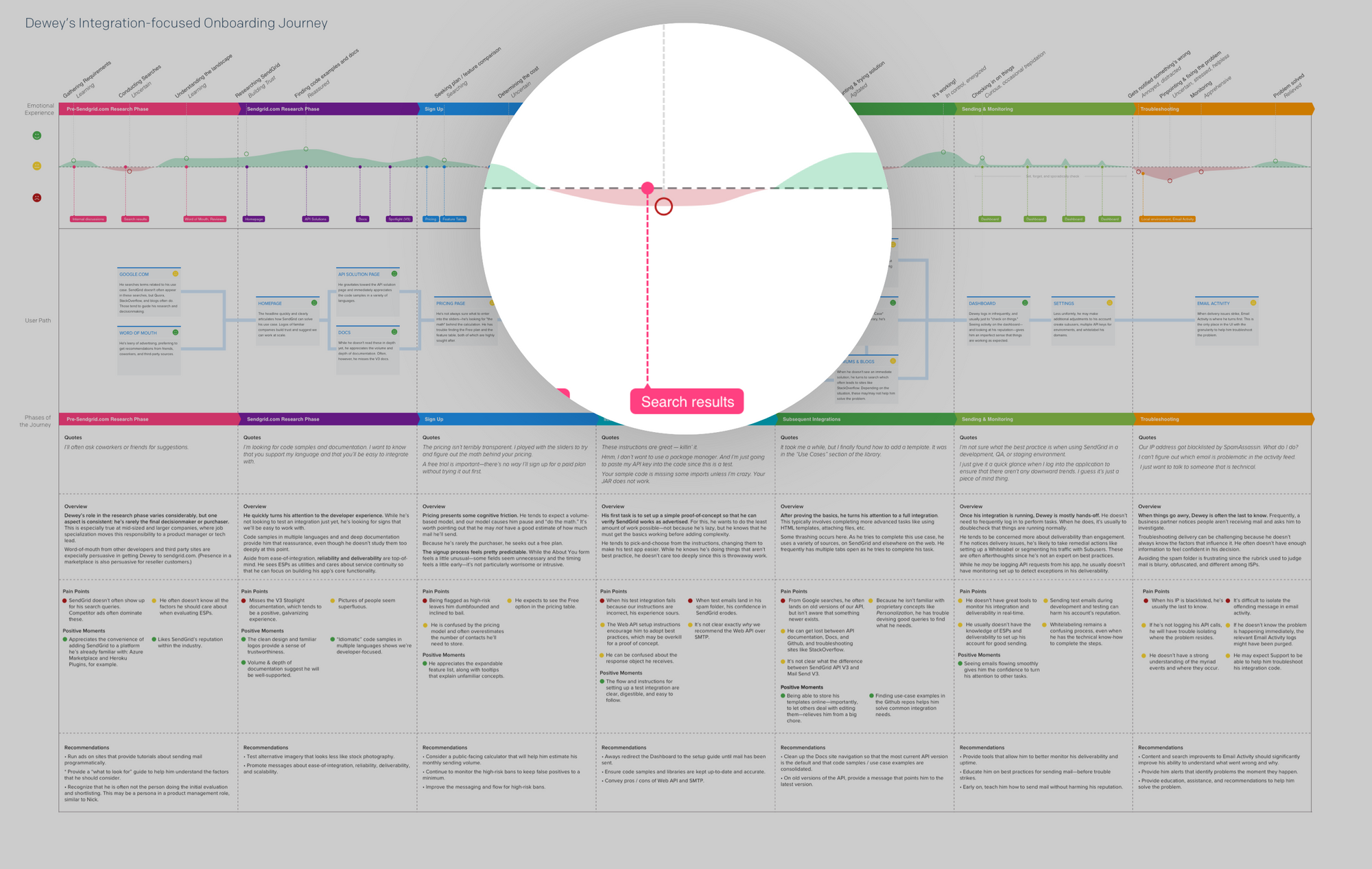
Emotional highpoints and valleys are plotted along the journey.
A simple flow diagram helps viewers understand where problems lie.
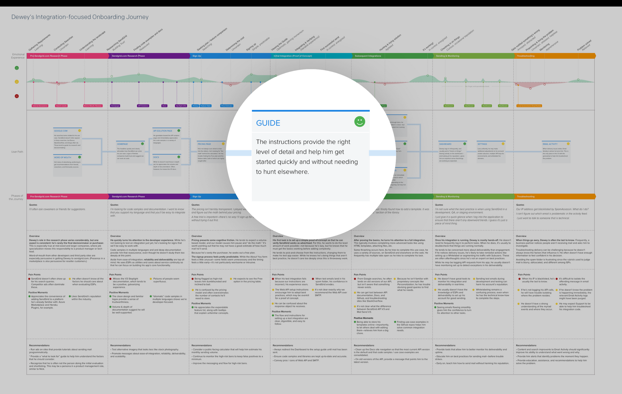
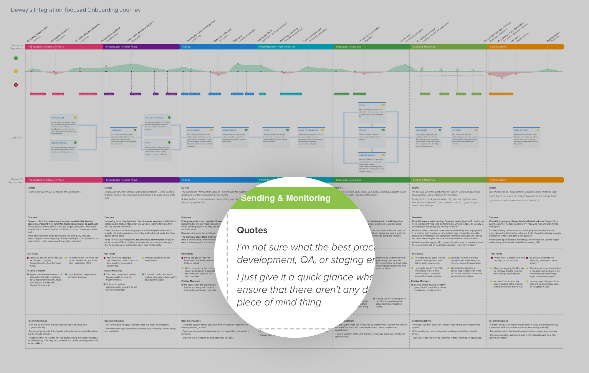
Quotes from sessions help build empathy.
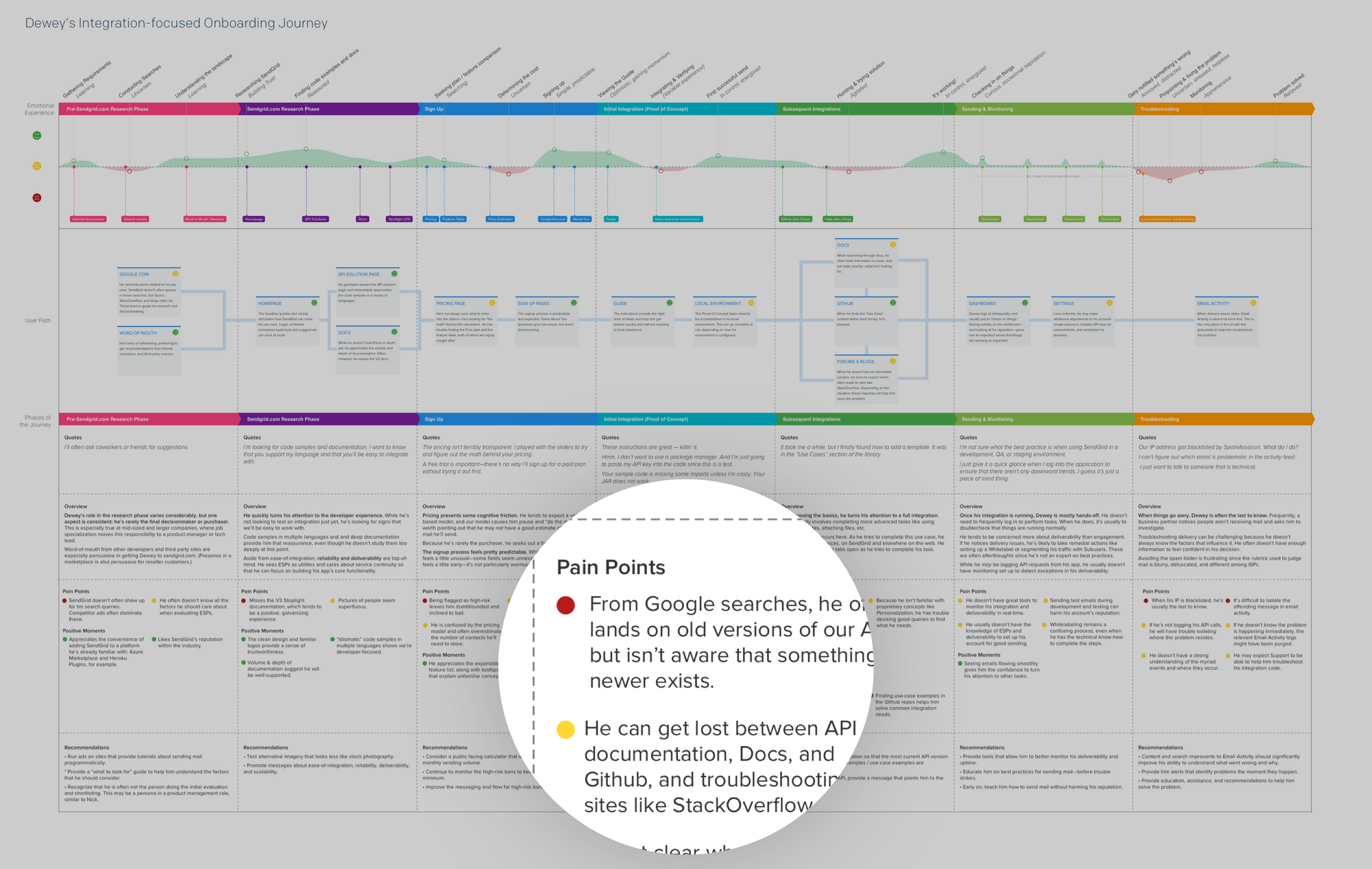
Specific pain points are revealed and classified by severity.
Results
The biggest benefit was building awareness and influencing prioritization. The valleys of experience, relative to one another, point to areas that deserve attention. Subsequent redesign projects, including the Activity Feed and Whitelabel redesigns, emerged from this project.
Finally, this map provided a means for collaboration. Many points of friction exist “between departments” and this artifact encourages people to work together to improve the experience.